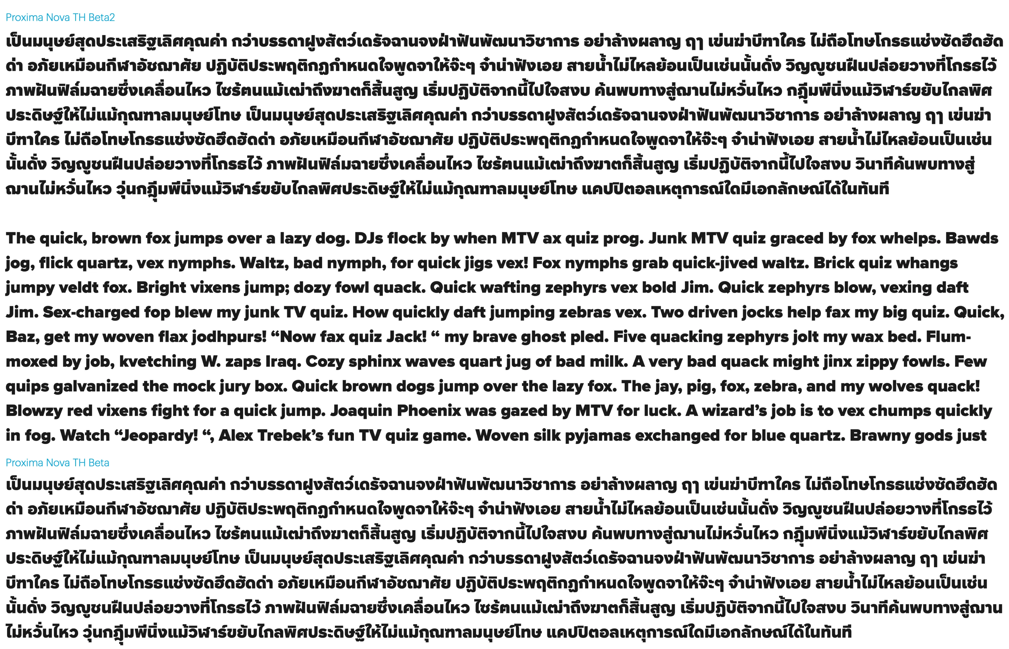
Proxima Nova Thai
- Design
- Project management and production support
The Thai version of Proxima Nova was designed by Smich Smanloh of Cadson Demak, who found a way to translate the critical characteristics of the Latin original for the Thai script: balancing a strong personality with an ability to adapt to a variety of contexts.
Proxima Nova Thai comes in both looped and loopless varieties. There are no semantic differences between the two styles — they represent the same characters and convey the same linguistic meaning — but the more traditional looped style features literal loops in some character designs. The loopless style emerged in the 1800s as a simplified form and might be considered for more practical typesetting scenarios, as the overall height is shorter than the looped style.
Some loopless characters more closely resemble Latin characters, as in the case of noNu (น) and u. Although they appear visually similar — and therefore, the Latin can be taken as a reference point — the Thai requires more legibility in the negative section below the bowl.

The Latin lowercase u and noNu-thai may look identical in terms of structure, but details such as the negative space under the bowl have to be amplified to avoid confusion when paired with letters such as moMa-thai.
Smanloh says that their Thai expansion manages to be suitable for small sizes while maintaining Proxima Nova’s modern tone of voice. He explains that this comes down to two key points:
The first is the positive space (black space), such as the curvature, which has geometric features and a sharpness to the terminals. Due to the nature of Thai character anatomy, sharp terminals are not often seen, and they’re rarely cut at 90° (usually 180°). This is one of the few fonts where the terminals are cut 90°.

Certain details and structure have been taken from Latin to be used in Thai, with tweaks to proportion to follow looped Thai conventions.
The second point is the negative space. When used in small sizes, such as on websites and on various screens, the counters of Latin characters such as R, P, and B are noticeably larger than usual to keep the readability and legibility intact. “So when we take this optical adjustment and apply it to the Thai characters,” Smanloh explains, “there are some limitations. For example, for characters such as yoYak (ย) or loLing (ล), if we make the counters on top match the conventions of the Latin version, this could lead to some misunderstanding.” Another thing to consider is the balance of the characters itself. In the case of loLing (ล), the top counter can’t be too large because it would be disproportionate. This meant the designers needed to find the balance where it appeared similar to its Latin counterpart when the two scripts were used together.

Certain details, such as the top counter of B, P, and R from Latin uppercase, have been applied to its Thai counterparts that also have crossbars in their letterforms. Here, the negative space in the top region highlight of yoYak (ย) and loLing (ล) was given the same treatment. This ensures a more consistent color when used in smaller sizes.
One of the biggest hurdles when creating a Thai version of a pre-existing Latin typeface is balancing the bolder weights in both looped and loopless styles. “The looped has the most challenges when we compare the two styles,” Smanloh says. “Fundamentally, Thai doesn’t have super bold styles. The Thai script has a lot of intricate details, and they can be difficult to convey in a monolinear stroke weight.” This can result in the bolder weights of different fonts looking quite similar, as designers run out of space to define the more unique shapes.
The looped version requires additional logic because it introduces the loop element that represents the beginning terminal of the character. There is also a knot that usually appears mid-stroke, which isn’t found in the loopless style.

Note the combination of looped and loopless styles in this specimen.
In the case of Proxima Nova Thai, there were some specific design decisions that had to be reconsidered when it came to balancing the looped and loopless styles across these bolder weights. “koKai (ก) is a great example,” say the designers. “The design of the beak of koKai is dependent on the weight expansion. Traditionally, having the beak fill the counter of the character leads to better readability, but when we look at this design in the bolder weights, it’s extremely difficult to pull off. This is why the beak of koKai looks as it does in the finished typeface.”
Huge importance is placed on koKai because it’s the character that appears the most when seen in text. The body of koKai is also shared with characters such as thoThung (ถ) and noNaen (ณ). Apart from the weight, the style of the looped and loopless versions also factors in the decision-making process. “For example, if we kept the beak filling the counter of koKai and added head loops into the counter for thoThung (ถ) as well,” the designers explain, “the design would be very hard to manage for Looped Bold. We didn’t want the overall texture of Thai and Latin to look too different from one another.”

Early sketches for how to tackle common characters and shapes.
The designers also cite the problem posed by the seemingly basic consideration of character height in this caseless script. Thai height lies between the Latin uppercase and lowercase characters, leaning a bit towards the lowercase. “In the case of the bold or black master, when we visually compensate so that the negative spaces don’t create flares, the overall typographic color looks too light,” the designers explain. “We can’t just add more value to the stem because we have to account for how the Thai script is used in multilingual settings. Is it just Thai in one paragraph accompanied by Latin in another paragraph? Are the two scripts used together? This is why we have to find the perfect balance when used in these two different scenarios.”
A comparison between the first version and the final version. In the first version, the Thai characters are thin because of the overcompensation in terms of optical illusion. In the final version, they increased the stem value, which results in bolder weights looking better when used with Latin.
“Although it might appear to go against type design fundamentals, Proxima Nova Thai called for some eccentricities,” the designers explain. For example, the ear of the character soSua (ส) doesn’t extend outwards enough to distinguish it from the character loLing (ล). “In the looped style, the head loop itself takes up a lot of counter space, which is why the ear of soSua (ส) might not stand out as it should. The designers needed to find a solution to make the looped style more legible, and that came in the form of a stroke in the counter of the body to connect the ear of this character to the upper bowl of soSua (ส). So, in smaller sizes, this now reads easier without the need for an additional stroke.

Note the 90° angle of oAng (อ)’s crossbar, which can be used in both looped and loopless styles.
As with koKai, several other control characters were used as well, such as loLing (ล), which has many similarities to the Latin a. The terminal of loLing (ล) also set up how to control other characters as well. Another was the tail of the Latin Q, used as the ear of soSua (ส), which needed to evolve in the looped style, or U, used to set up the curve for Thai characters such as boBaimai (บ) or noNu (น) — although this was edited to keep the geometric essence of Proxima Nova.
Tradition aside, whether one uses looped or loopless is a matter of choice. Anuthin Wongsunkakon, founding partner at Cadson Demak, pointed out that because loopless is “more modern and simplified,” there is a “slow move toward loopless being accepted as body text.” Ultimately, picking type is subjective, and whether it’s Proxima Nova Thai Looped or Loopless, a skilled graphic designer or typographer can’t go wrong with either choice!