Proxima Nova Latin+
- Design
- Project management and production support
Proxima Nova started life as an idea Mark Simonson had way back in 1981 and is now one of the most widely used and read fonts on the web.
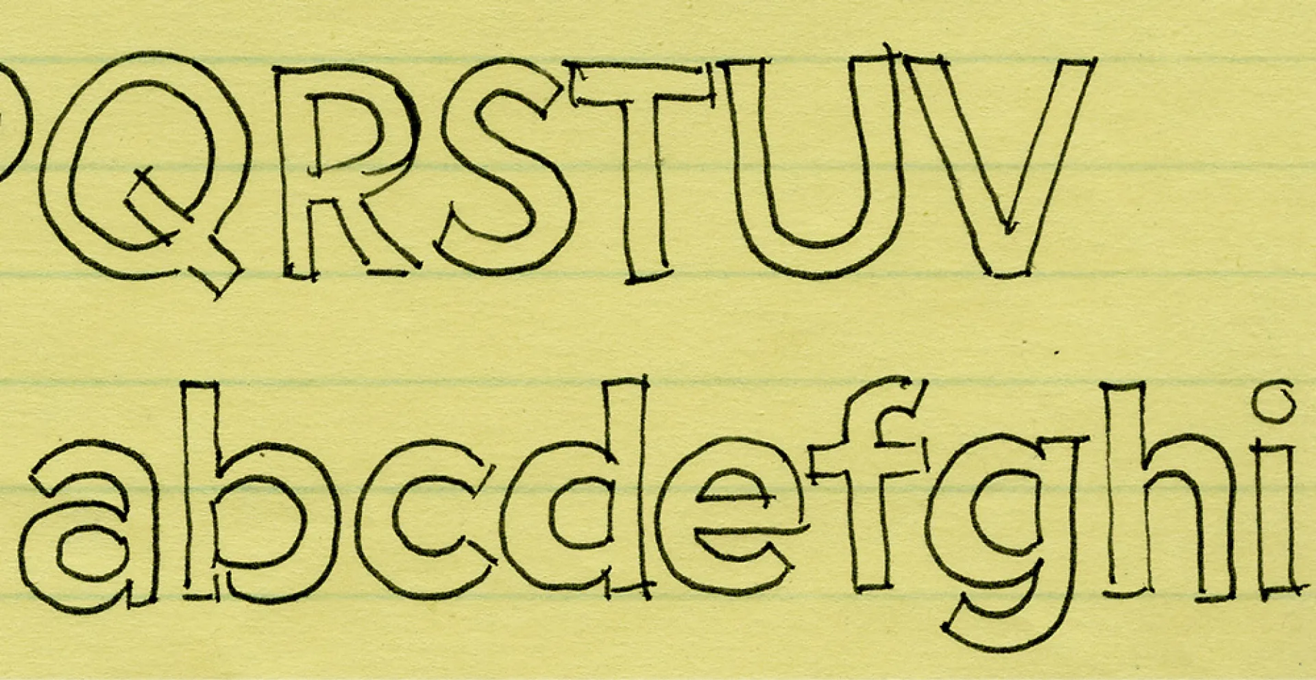
The original sketches for the typeface, which Simonson initially called Zanzibar, portray a concept for a lowercase that’s remarkably similar to what it would eventually become. Over time, Zanzibar became Visigothic, so-called since it was modeled on American “gothic” faces. Ten years later, while Simonson was working as the art director of Business Ethics magazine and using Gill Sans for the type, he wanted something a bit plainer and more modern that still had a geometric feel. His work-in-progress Visigothic was the perfect candidate.
An early sketch of Zanzibar, which would eventually become Proxima Nova.
Visigothic’s proportions and stroke contrast were influenced by the likes of Helvetica and Akzidenz Grotesk, but its construction and details were borrowed from Futura, Kabel, the ATF gothics (Copperplate Gothic, News Gothic, Franklin Gothic, etc.), and the U.S. Federal Highway signage typeface. The result was a hybrid: a typeface combining modern, even-width proportions with a somewhat geometric appearance.
Simonson renamed the typeface to Proxima Sans (an “approximation” of other sans faces) and released it through FontHaus in 1994 as a family of six fonts: Regular, Medium, and Black, with matching italics. He says he also liked the name Proxima Sans because the letters used in the name happened to display some of the more distinctive characteristics of the design.
Although Simonson always had plans to design more weights, small caps, and a condensed version, the realities of becoming a new parent and taking on a new full-time job left him without the time or energy to continue working on it. But by the early 2000s, he started receiving requests to broaden the Proxima Sans family, and Rolling Stone chose it as part of its 2003 redesign. Encouraged by this newfound exposure, Mark went back to work on an expanded Proxima Sans family — one that was even more ambitious than he’d originally planned.
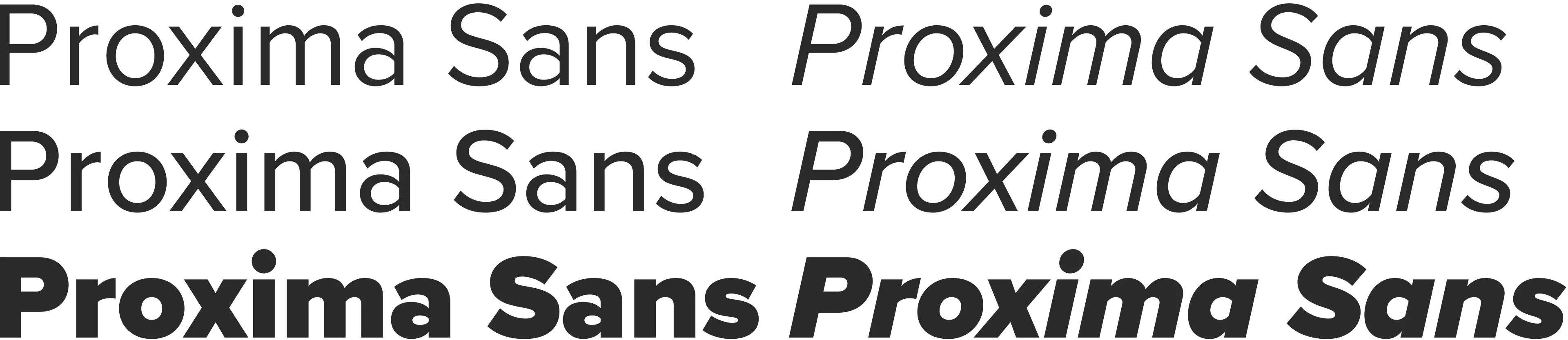
In 2005, Simonson re-released the resulting typeface as Proxima Nova — a family of 42 fonts: seven weights and three widths, each with matching italics. Built from the start with the OpenType format in mind, it featured then-advanced typographic features such as small caps, different figure styles, fractions, and alternate characters — enough to take on the most demanding typographic applications.
As well as the additional weights and widths, Proxima Nova also contained other improvements over the original Proxima Sans: Simonson reviewed and refined every character, redrew the italics from scratch, and re-hinted everything for better on-screen display. The character set grew from 245 up to 699 characters, which now included proper math symbols as well as the dingbats and arrows that had been present in the original version.
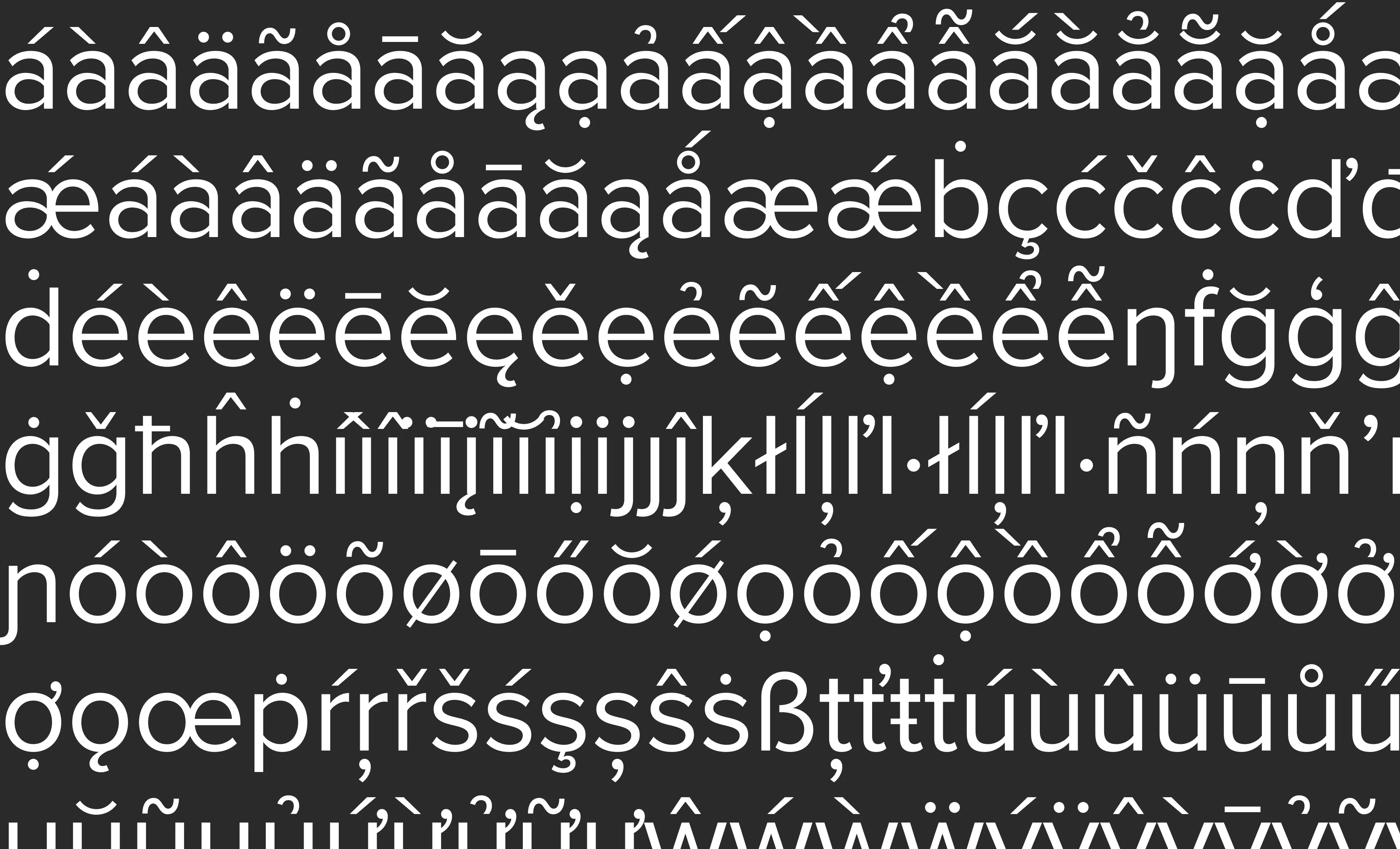
In the years since Proxima Nova’s release, Simonson has continued to make improvements and enhancements to the family, including a new Medium weight and two new widths (Wide and Extra Wide) that bring the number of fonts to 80 and the total glyph count to 1456. New diacritics to account for Latin Vietnamese were added in 2015 at the request of Apple — who had licensed some weights of Proxima Nova to use in a few of their apps, including Garage Band and Pages.
On top of this, Simonson made dedicated Cyrillic and Greek expansions himself, and now, in 2024, The Type Founders have enlisted some of the world’s leading type designers to create brand new script expansions so that Proxima Nova now covers the Arabic, Devanagari, and Thai writing systems with more coming soon.