Proxima Nova Greek
- Design
- Project management and production support
The multicultural popularity of Proxima Nova began to grow when support for Greek was added in 2009 and Cyrillic in 2010 — and they were both designed by Mark Simonson himself.
Proxima Nova’s Greek expansion started when a designer at Fallon London contacted Simonson in early 2009. He was already considering both Greek and Cyrillic expansions at the time. Still, this request inspired Simonson to commit, and he finished the Greek expansion later that year.
Simonson says that he had no formal training with the Greek script, but instead worked the way he always has when adding extended language support: “I would look around and see what other people do. I was constantly flipping through the big, yellow FontShop catalog and seeing what other people had done with other script expansions.”
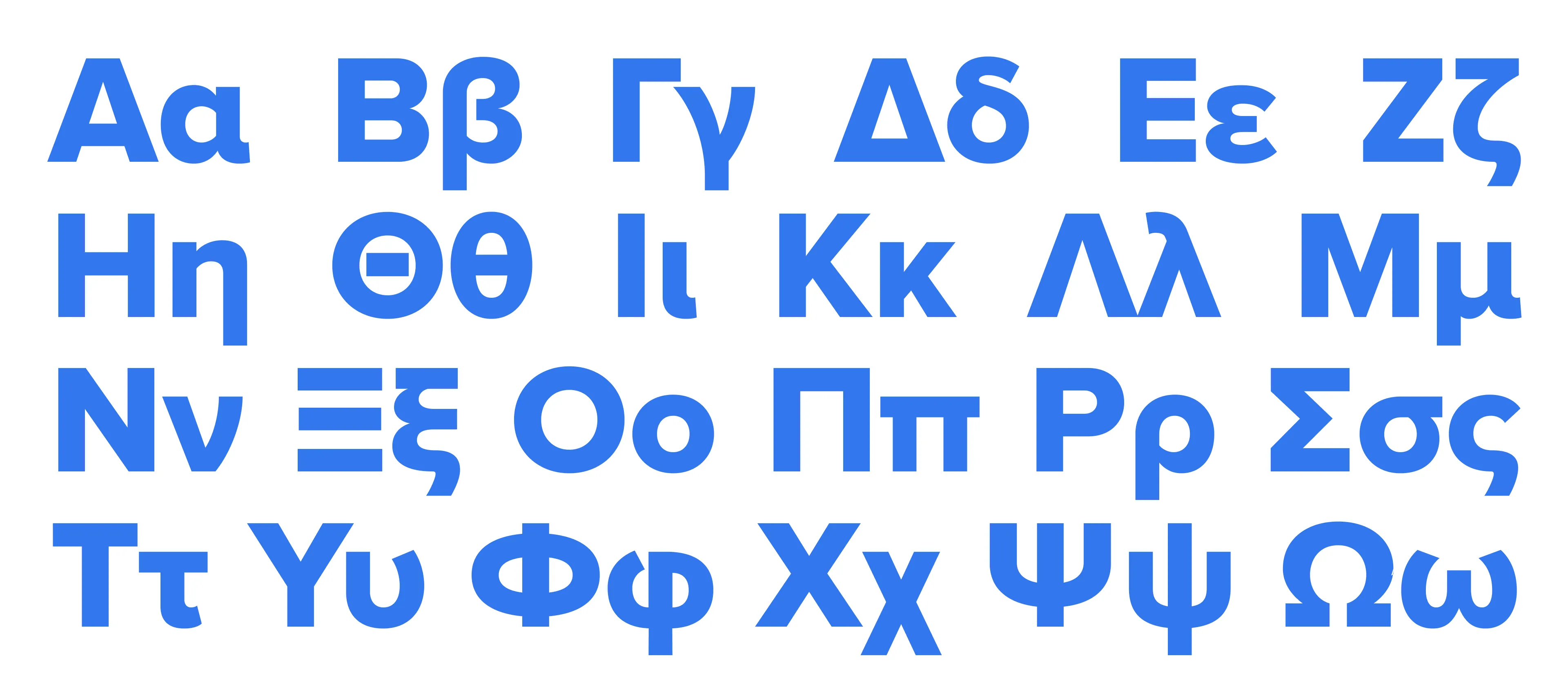
When it was originally released, Simonson fondly remembers Gerry Leonidas, Professor of Typography at the University of Reading, having kind words about the design. Although that conversation was never committed to the page, we reached out to Gerry, who commented that Simonson’s Greek expansion of Proxima Nova is “a measured and balanced interpretation, with overall correct structures in the letterforms, which keeps a consistent texture across a wide range of weights and widths that strikes a good balance between respecting the variety of the Greek counters and terminal strokes, and harmonizing with the texture of its Latin counterpart.”
When designing secondary scripts to pair with an existing Latin typeface, simply applying all the same design decisions doesn’t work. Sometimes, compromises have to be made. Irene Vlachou, a Greek type designer who also mentors, teaches, and consults with foundries and schools around the world on Greek type design, says that “Proxima Nova Greek is a successful example of ‘translating’ a Latin typeface to another script, in this case its counterpart Greek.”
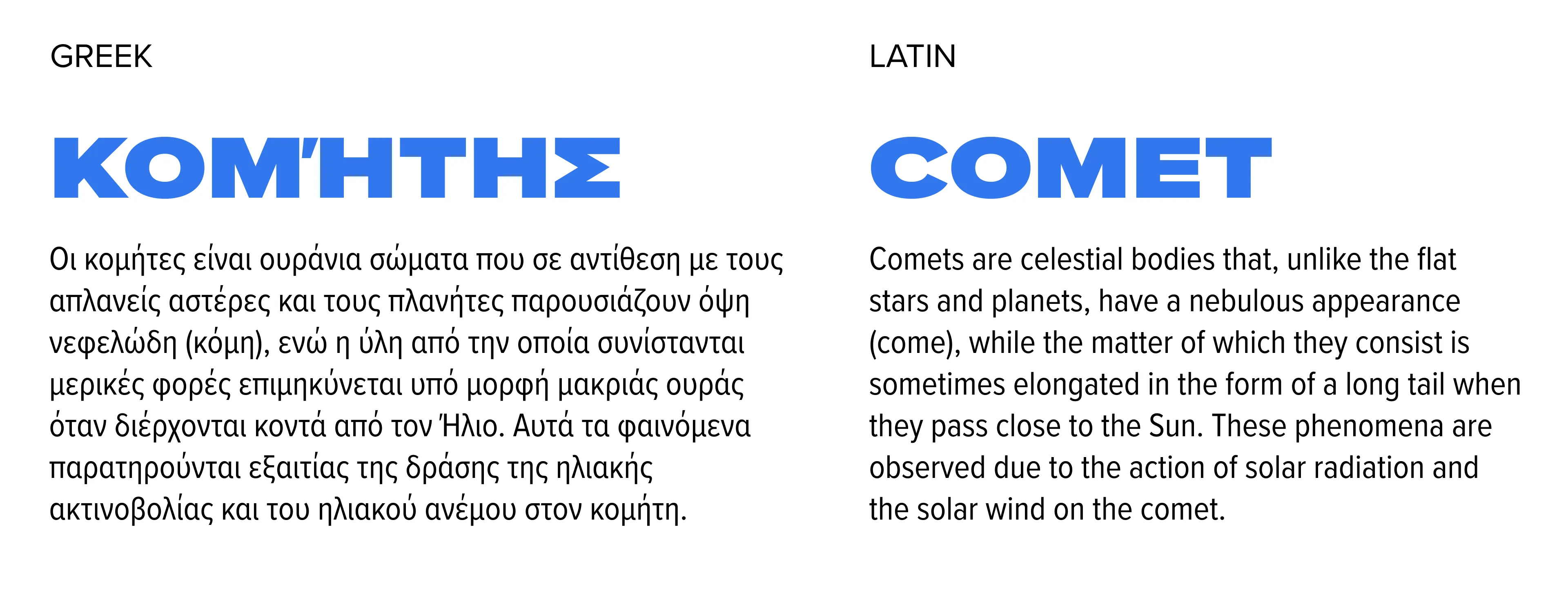
Vlachou agrees with Leonidas that Proxima Nova’s “clean and straightforward qualities are present in the Greek without compromising the Greek alphabet. The uncomplicated structure allows the Greek set to have a fresh modern look and at the same time to be faithful to its roots. With a great variety in weights and widths, it is a highly recommended font family for multipurpose usage, across formats and sizes.”