Proxima Nova Devanagari
- Design
- Project management and production support
The Devanagari version of Proxima Nova was designed by Vaibhav Singh and Alessia Mazzarella, the founders of Typeland. Their interpretation elegantly addresses script-specific features such as knots and conjuncts, and uses stylistic sets to support Marathi and Nepali alternates.
As with any expansion, maintaining the conventions of the script as well as the expectations of an established typeface is a fine balancing act, and Singh says that he doesn’t think there is a predetermined way to go about it. “What often happens is that because a certain kind of example is more easily available and prominent, it becomes the default without anyone really questioning it,” he explains. “In the case of Devanagari, this is very common in the form of Latinization — you get the same ideas used in Latin directly applied to Devanagari, such as thinning at every place where strokes join the vertical stem. It’s an easy solution, but not always the appropriate one, nor is it the only solution. It certainly shouldn’t be the default approach.” He adds that while it’s widely acknowledged that every script has its own specific characteristics and design requirements, in practice these are often too easily sacrificed to Latin-based principles — sometimes as a “path of least resistance” and other times through a “misleading notion of modern design.”
But this presents a tricky scenario for something well-established, like Proxima Nova. “In designing a Devanagari companion you try to manage the overall feel — at a word-, line-, and paragraph-level — to get somewhere close to the style of the Latin without going for one-to-one correspondence”, Singh says. “It’s not as black-and-white or mathematical as one might think.” Subtle adjustments are an integral part of the design process, for example, to achieve an evenness of weight and color, the stem width in Devanagari is kept slightly lighter than the corresponding stem width in Latin.
Relative proportions between the two scripts are resolved in a way that provides a comfortable height for Devanagari characters, especially in the heavier weights where the Devanagari headline sits subtly above the ascender height.
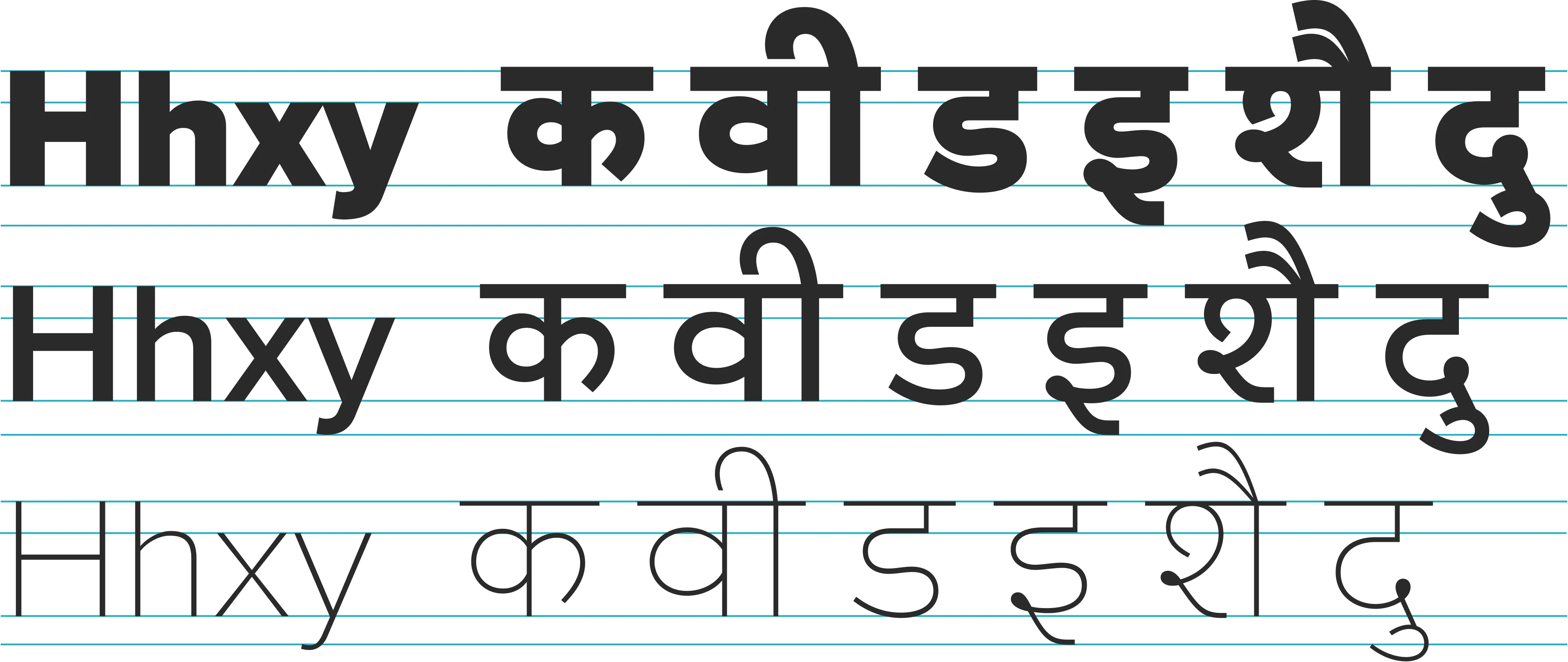
Like most Indic scripts, Devanagari is an alphasyllabary — a writing system that combines consonants and vowels into syllabic units. So, unlike in an alphabet, in Devanagari, vowels turn into vowel signs when combined with consonants, which attach to the base character in different ways (i.e., above, below, before, or after). Although there are many nuances within such a system, one of the most obvious effects is that the characters and their combinations can become much taller or deeper, requiring more vertical space compared to Latin characters.

Clear counters and open shapes for characters with generous proportions. Evenly angled terminals and rounded strokes reinforce the gentle diagonal rhythm.
This can be a challenge when adapting an existing Latin-first design, such as Proxima Nova, where the metrics and proportions have already been determined, and may need to be followed or at least reflected to some extent in other scripts. It’s mainly at the extreme ends of the glyph box that the designers can push the (quite literal) boundaries required for the proportions required by the Devanagari script. In Proxima Nova, key relative proportions between the two scripts are resolved in a way that doesn’t compromise a comfortable height for the base characters in Devanagari, given that Latin ascenders, descenders, and capitals are significantly compact. (Note that line-height settings are generally much more open when setting Devanagari text — it is unwise to try and match line-height values to the Latin text.)
The counters in Devanagari letterforms also tend to be more involved. “There is a hierarchy of counter sizes across different characters that requires appropriate handling — one size does not fit all,” Singh says. “It’s not merely a case of opening up small counters — it is a design choice, you can opt for closing some and opening up some others, but you need to be able to make those decisions sensibly in relation to legibility and the overall style.”
An enduring test with Devanagari designs — especially an expansion that has to match pre-existing Latin weights — is that the heavier weights tend to have very dense shapes and, therefore, even smaller counters. Mazzarella recalls this being brought up in one of the very first conversations with The Type Founders: “The first thing that we usually do is to check how dark the typeface gets. Because there’s a point where if it’s way too dark, then the overall Devanagari setup has to be reimagined to make sure that the masters and in-between weights in Devanagari are designed to match the weights in Latin appropriately.”

Closely related loop counters to achieve maximum clarity and connection in characters. Rounded knots create a smooth style, with stronger suggestions of the natural stroke sequences. Extended diagonal strokes create harmonious connections as well as a horizontal flow and stability.
The feedback on Typeland’s first presentation — of those key decisions that would affect a lot of the texture — was very positive. “So then we basically just ran with it,” Singh says. “Initially, for the shaping of the knots, we thought it would be nicer if we had a flat base rather than a rounder base, but we ended up testing different options and finding that the knots integrated more smoothly with rounded ends.”
Proxima Nova’s ability to successfully fuse geometric forms with grotesque forms isn’t something that’s commonly seen in Devanagari type designs. “Usually you have designs that are clearly geometric for Sans typefaces, or you have designs that are classical as with Devanagari companions for Serif typefaces,” Singh explains. “There isn’t a ready template for translating the subtler qualities of a grotesque or neo-grotesque style as such, especially one that goes beyond simply mimicking Latin curves and stroke modulation.” He adds: “we considered it better to approach this question of style by thinking about the elemental forms of letters; i.e., by introducing subtleties of flavor and texture from the design of one script to a different script without distorting the basic shapes or the expected stroke modulation of that script.”
Across the full spectrum of Devanagari typefaces in the retail market, it is particularly common to find designs that are either intentionally or unwittingly Latinized. “I’m really happy to have had the chance to create something which isn’t that, especially for a typeface as remarkable as Proxima Nova,” Singh says. “It is quite surprising that even today Latinization seems to be the major paradigm for designers, as if other approaches aren’t possible or meaningful.” He is quick to note that it is not a question of a right-or-wrong way, or rules to be followed, but about understanding context: “Reversed contrast is a thing because conventional contrast is a thing,” he says. “You can ignore convention, but that’s not the same as denying it, or worse, not knowing it.”

The initial approach (above) with flat terminations was eschewed in favor of a more smooth and continuous character (below) for the knots.
In Latin typography, the idea that type should have an even, gray texture is key. But that’s “thrown out of the window,” Singh says, with a script like Devanagari, “where you’ve got knots and loops and other elements very different from Latin that are essential for legibility.” Another key difference with Indic scripts like Devanagari is that the expected or conventional contrast — i.e., the weight distribution within strokes, and the angle of stress — is in the opposite direction to that of Latin. These distinct features mean that designers have to think beyond mechanical application of design characteristics in an existing Latin typeface and apply ideas with some understanding of what works well for a particular script — “in a way that letterforms don’t become caricatures of themselves,” Singh adds.
Typeland’s initial presentation of Proxima Nova Devanagari featured a distinct stylistic approach for characters such as र, स, and ए that have diagonal strokes, where a horizontal extension was introduced to achieve width and connection. During testing, the proportions were adjusted to give the characters even more room to breathe, which provides an expansive feel to the design and reflects the style of the Latin. “Those changes really gave the Devanagari design the key characteristics that it now has,” Singh believes, “which is a strong horizontal flow and balance for characters with diagonal elements.”

Early drawings of the character Ra superimposed with several subsequent versions to show the gradual evolution of wider proportions for the character.
In what is a particularly useful addition and a thoughtful provision, Proxima Nova Devanagari ships with stylistic sets for Marathi and Nepali, in addition to the standard language tags used in several applications. Typeland’s motivation was to make these language variants available to anyone setting Devanagari for non-Hindi text in software that doesn’t automatically substitute these forms based on language selection (such as Figma).

Top row: Hindi forms. Second row: Marathi forms (similar to Hindi forms, and therefore the same width). Third row: Hindi forms and numerals. Bottom row: Nepali forms and numerals (substantially different from Hindi/Marathi forms, and therefore not the same width).
“Where possible, we’ve designed alternate shapes to have widths consistent with the default shapes, such as Marathi La and Sha that are quite similar to Hindi La and Sha,” Singh explains. “This helps minimize the reflow of text when switching between alternate characters. Of course, you can’t entirely eliminate reflow as some alternate characters are drastically different in shape and style,” he adds.
“Designers spend so much time doing a lot of interesting things and adding nice features to fonts, then they don’t communicate that these things exist,” Mazzarella says. She is keen to show potential users that there are other possibilities and alternatives that can be used on platforms that may not directly support language tags.
A sample page from Wikipedia used in the testing process, with Hindi text in Proxima Nova Devanagari.
Mazzarella explains that part of the testing process involved working with large amounts of real-world text: “I would just substitute Wikipedia text or newspaper articles with Proxima Nova Devanagari, among other things, just to make sure that I have a big sample of text that I can see.” And she says that “websites with lots of text, where you actually need to read comfortably and where you need the texture to be calm and easy on the eye,” is the kind of setting where she’d love to see the type employed.