Proxima Nova Cyrillic
- Design
- Project management and production support
Unlike the other scripts featured on this website, Proxima Nova gained support for Greek in 2009 and Cyrillic in 2010 — and they were both designed by Mark Simonson himself.
Simonson’s interest in Cyrillic dates back to the 1970s when he picked up a guide to learning Russian from a bargain bin in a drugstore. “Even before I was a type designer, I was just interested in type in general,” he recalls, “and I would actually try to imagine what different typefaces would look like in Cyrillic — so I already had some kind of interest in it, long before I was doing Proxima.”
Simonson says that he had no formal training with the script but instead worked the way he has done: “I would look around and see what other people do. I was constantly flipping through the big, yellow FontShop catalog and seeing what other people had done with other script expansions.”
The Cyrillic expansion came about at the request of a designer at the Reima Group in Finland, who reached out to Simonson in early 2010. They had heard that he was working on the Cyrillic — something he’d started a while ago, along with the Greek — and, as with the Greek, this specific customer request offered him the motivation to finish the expansion. It was completed in June 2010.
The Cyrillic version was well received, but when Simonson inked a deal in 2014 to distribute Proxima Nova with Paratype, the foundry’s type director, Alexandra Korolkova, suggested a few tweaks to the design, offering her expertise as a native Cyrillic user and experience as a Cyrillic type designer.
“When I did my later Cyrillic expansions, I spent a lot of time looking at the Paratype website and the Cyrillic expansion they’d done with Western typefaces,” Simonson recalls. “I got about 95% of the way there, I think, and Alexandra provided the final tweaks.”
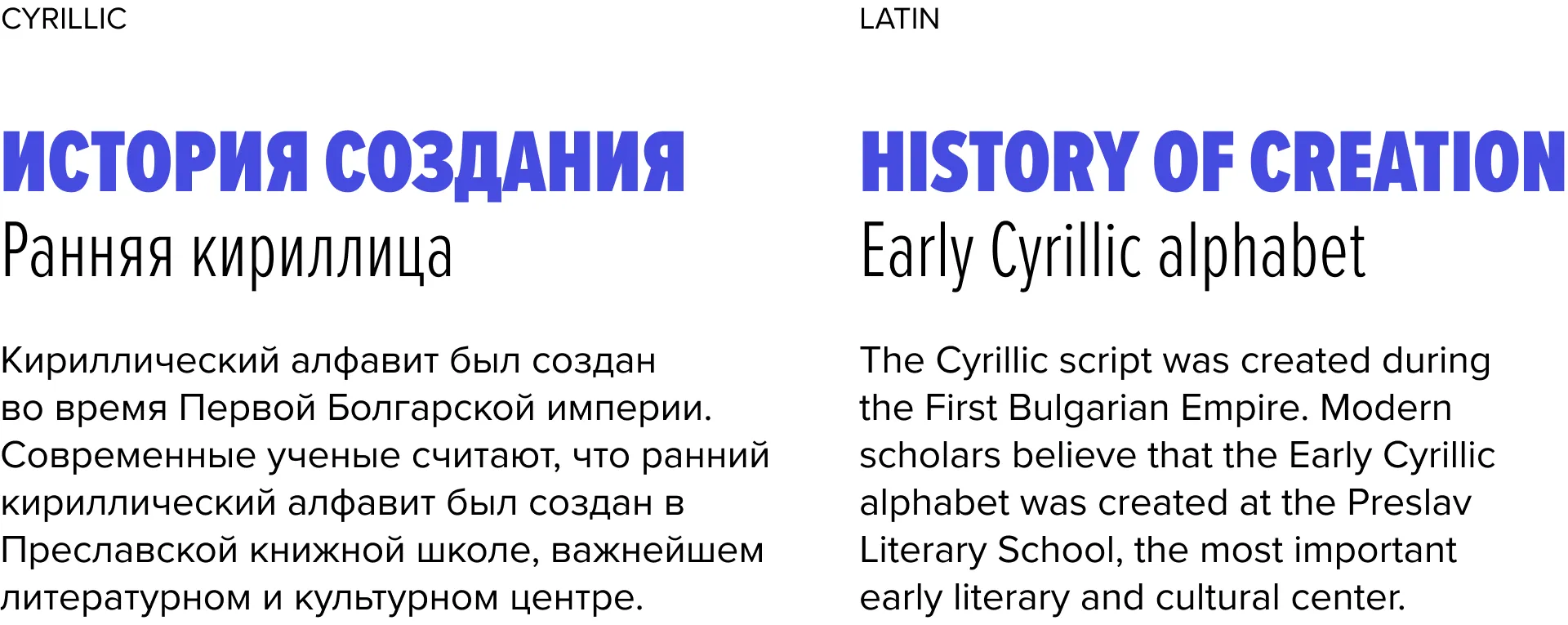
Cyrillic is characterized by many straight angles, diagonals, flat serifs, and two-story forms such as в, к, н, and я. There are no single-stem letters like i or l, but there are some three-stem like ш. This can result in a fairly different typographic color throughout the text.
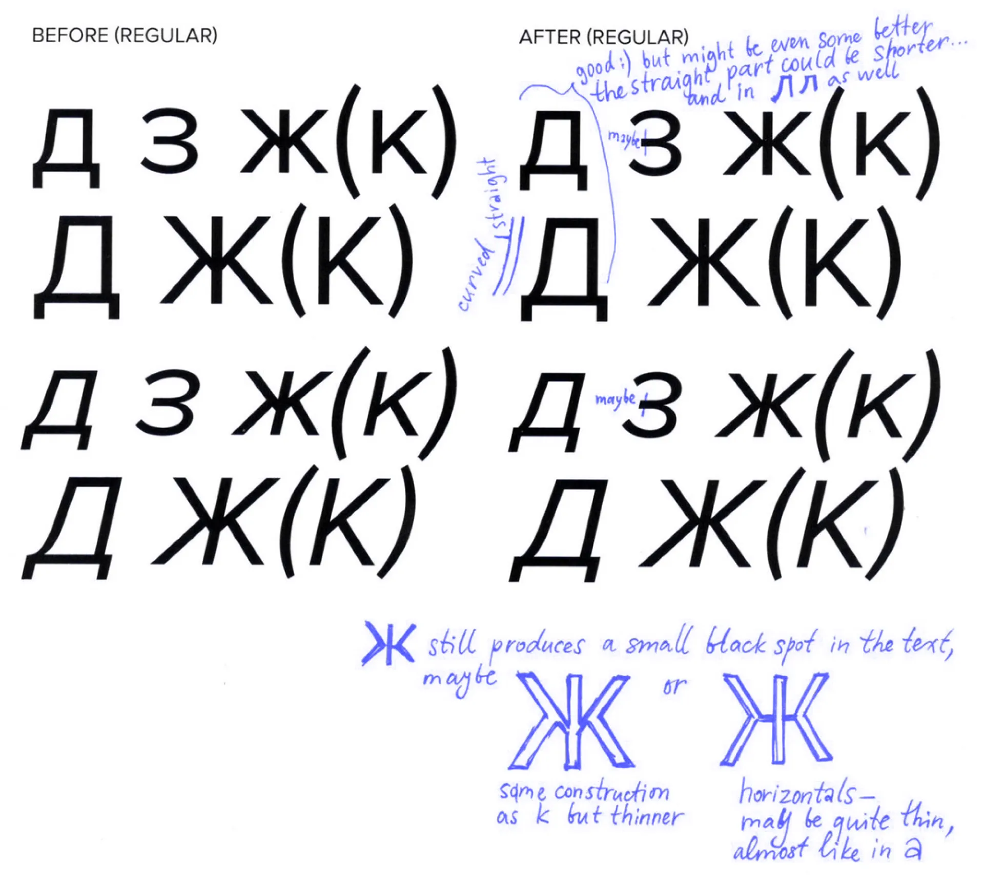
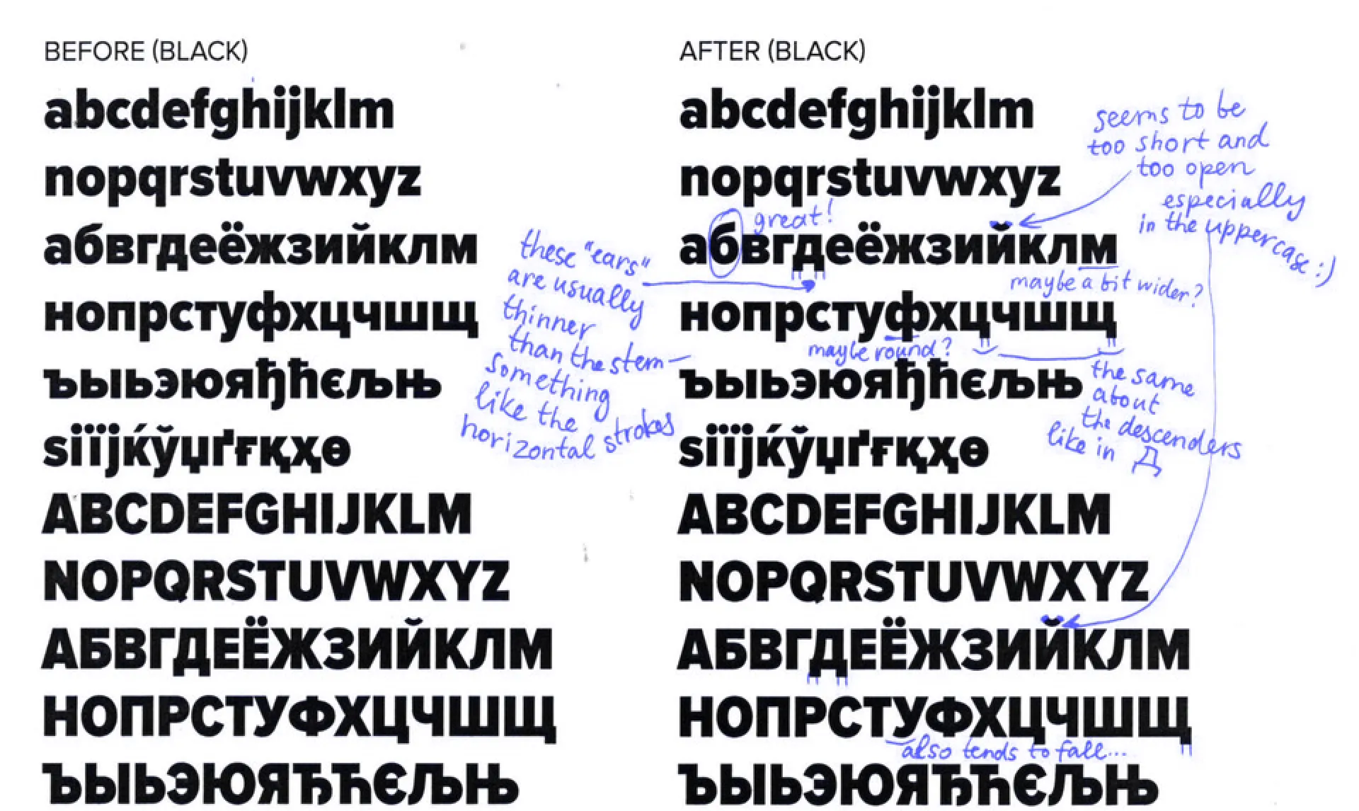
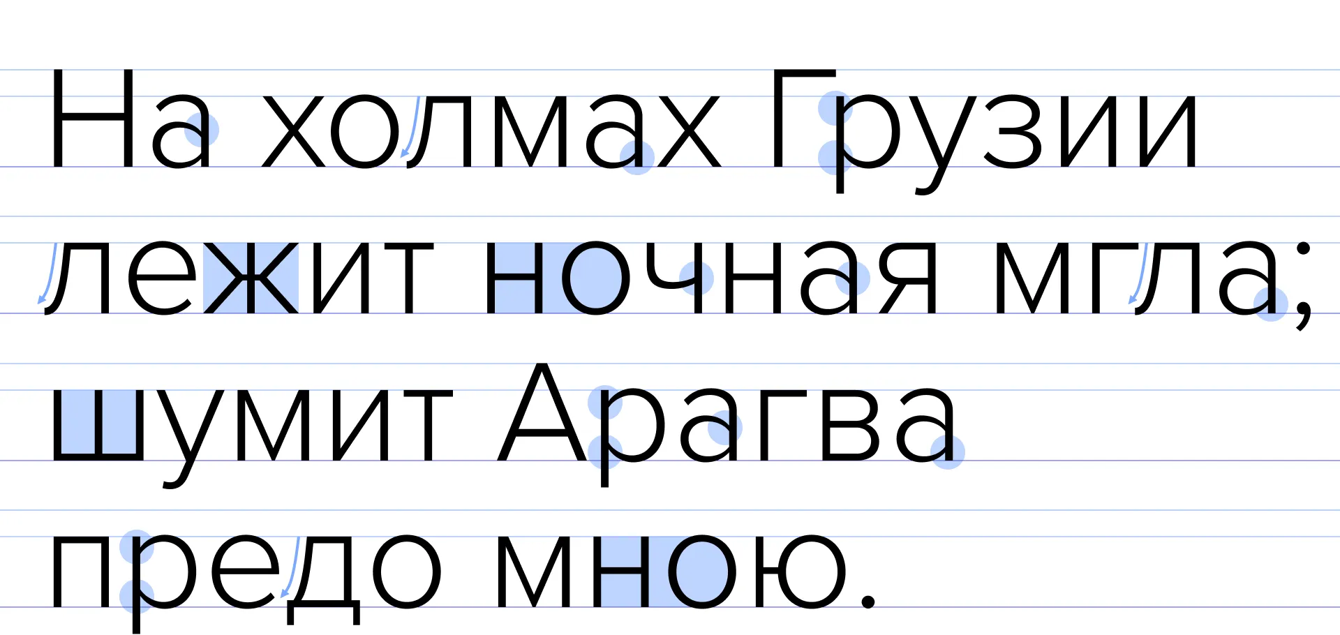
As with any new script expansion, the biggest challenge is to reinvent the shapes of diagonals, straight lines, and two-story forms to keep the voice and personality of the typeface as close to the original as possible while also maintaining the conventions of the script. In Cyrillic, optical compensation plays a big role because of characters such as в or м, which can be hard to balance in heavier weights. The same is true for spacing: when up to 80% of your text consists of pairs such as нн, он, and но, you have to balance the typical spaces very carefully.
Cyrillic also has some potentially complicated characters that have no hard and fast rules on how to draw them — sometimes, there are three or four socially acceptable variants of shape and the same amount of wrong ways to design. These are interesting for a skilled type designer because, in many ways, these can define the character of the typeface.
We caught up with Korolkova, who believes that Proxima Nova is like the person next door: “warm and friendly, yet universal,” she says. “It looks like a geometric sans from afar, but thanks to some contrast and a few traces of broad-nib pen logic, it’s neither cold nor aloof. The thinner stroke joints, like in a, help a lot to keep the weight in Cyrillic balanced, and the humanist-like shapes of л and ж help to produce the friendly atmosphere.” And because Proxima Nova has generally wide proportions, it’s easier to make the color of Cyrillic appear close to Latin. “Overall, it was great to work with Simonson, and he made the Cyrillic expansion so usable and versatile.”
Simonson did an excellent job adapting his Proxima Nova to this new script, overcoming all obstacles and hurdles, and giving designers and typographers the perfect companion in Proxima Nova Cyrillic.