Proxima Nova Arabic
- Design
- Project management and production support
The Arabic expansion of Proxima Nova was created by Khajag Apelian and Wael Morcos. The designers saw this as the perfect opportunity to give graphic designers and typographers an Arabic geometric sans that didn’t feel compromised by its Latin-first origins.
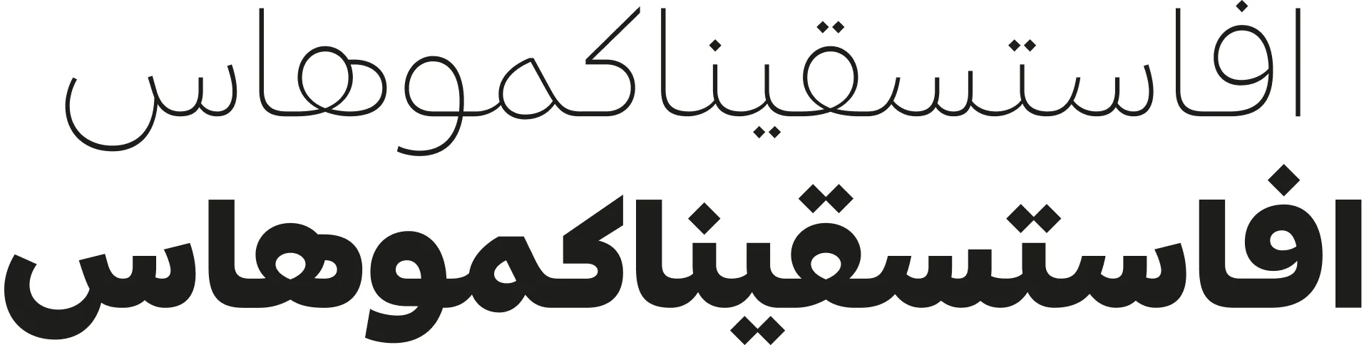
One of the most interesting characteristics about Proxima Nova — and an aspect that sets it apart from so many other Arabic expansions of Latin-first typefaces — is that it’s not just another grotesque; it sits in between the conventions of a grotesque and a geometric face. Designers might naturally look to each end of that spectrum for inspiration, but Apelian and Morcos instead first asked how they could apply this hybrid design to Arabic. “Grotesques aren’t really something that exists in this script,” Apelian explains. “We don’t have a set of grotesque typefaces or a set of geometric typefaces in Arabic; to bring this from that typeface, and this from that.” Instead, their approach was to look at their own portfolio of Latin grotesques and then bring some geometry to this project, to make it more “soft and human,” as Apelian says. “I don’t know if it’s a challenge, but these things present opportunities.” Morcos adds: “Our starting point is to always go back to the written form. We use our experience in previous projects to inform our decisions and always keep pushing the solutions we come up with every time.”
Morcos summarized the project’s primary challenge: “How do we translate Proxima Nova into the Arabic, making it as special as the Latin? And also create something in Arabic that is special, but that also speaks to its Proxima-ness?” The designers began their process as they would any typeface, whether an expansion or not: “When I’m designing an Arabic font, I’m not looking at how I can translate Latin features into Arabic,” Apelian explains. “I’m really just focusing on what you would always be focusing on as a type designer: on the functionality, on the aesthetic, on the style, on the connections.”
One of the fundamental differences between Latin and Arabic type design is that Arabic uses an inverted contrast, although Apelian is keen to point out that the inversion is not a direct, one-to-one translation. “There’s so much modulation in Arabic,” he says, which can lead to confusion in some designers attempting an Arabic expansion for an existing Latin typeface. “They might ask, ‘if you make this part thick, then why is this part thin?’ but it’s only obvious to the trained eye.”
Structurally, at the design level, there’s actually very little that naturally connects the writing system of Arabic with the writing system of Latin. Because of its calligraphic history, creating an Arabic font can often mean challenging the calligraphic rules inherent within the script. Apelian believes that, in many ways, “the only thing that connects an Arabic font to a Latin font is that they need to work together in a digital environment, and work together in the same design.”
He explains that the diacritic dots used in Arabic can also confuse designers who come from a Latin-first approach, comparing them to Latin diacritics. It’s not simply a case of putting the dot in a single position — there’s a need for interaction between the dots and the main letterforms.
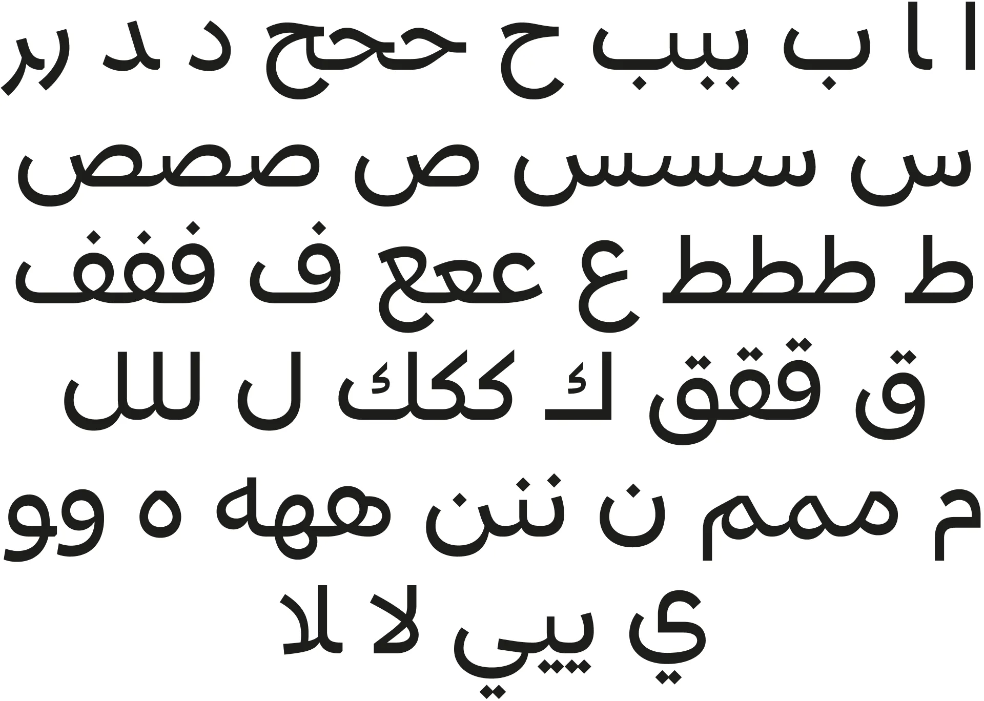
When Morcos and Apelian begin such a project, they start with a word or phrase — something equivalent to hamburgerfontsiv, which gives them the idea of the type’s personality — and use that to inform some initial design decisions, especially regarding how the strokes meet. From there, they expand the basic character set, before focusing on the special ligatures that are a key part of the Arabic script.
Morcos explains that many more test characters are needed to determine the overall feel of an Arabic typeface. “In Latin you can create an O, an H, and n, then maybe a few more letters — E, R, and S, and you can get a feel for what you’re trying to do with the typeface. But in Arabic, you need to draw many more letters to be able to clarify the design intention.”
He describes the process of creating reusable components: “Depending on how modular the typeface is, that can influence how we want to structure those components. In Latin, for example, the shoulder of the n and m are technically the same, but practically it’s a little bit narrower for the m. There are a lot of these instances in Arabic where you have parts that repeat, but they’re not 100% the same.”
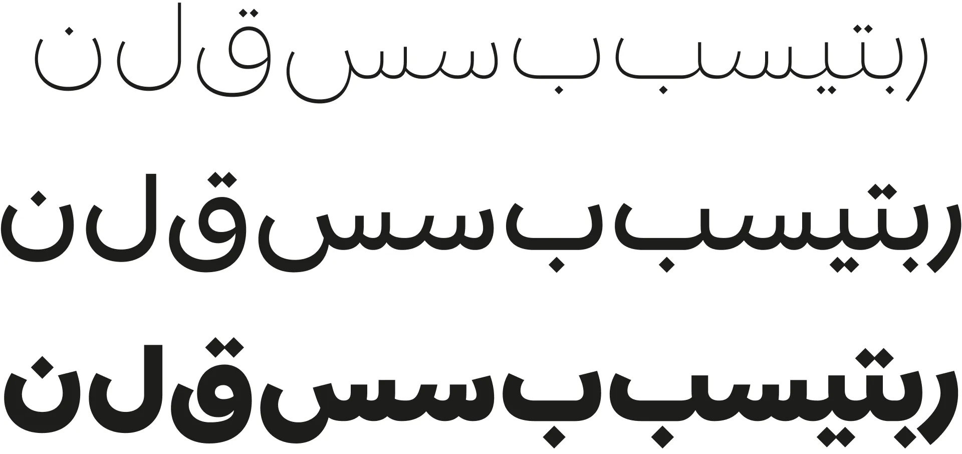
As with all Proxima Nova script expansions, the weights remain the same as the Latin, and adhering to these parameters can also be a challenge. Apelian explains that Arabic can be complicated because whereas weight changes in Latin will alter the letterform’s width, the inverted contrast in Arabic means that weight changes alter height as well. This is challenging because the vertical metrics can’t be altered radically, as they would then not complement the extenders in the Latin (and other scripts).
According to Apelian, designing the bolder weights is like a puzzle: “It’s like sculpting. You need to remove a bit here, add it there, and see how it goes. Is it too dark, or too light? How does that compare with the Latin? So sometimes we need to play with the skeleton of the glyph in the Black weight to make room for all this blackness. And that affects the Regular, so then we need to update the Regular.”

Occasionally, for some of the extreme weights, something might need tweaking “so the interpolation is smoother so that it leads to a nicer black-and-white relationship,” Morcos explains, “but most of the problems that arise usually appear in the early versions.”
“There’s a little bit of playfulness,” Morcos says of the Proxima personality as a whole, “but it never gets too quirky. It’s fresh in a geometric way.” Both designers say that the revision requests for their Proxima Nova expansion were very minimal. “The Type Founders had full respect and full trust,” Morcos recalls. “They pushed for the same goals we wanted to achieve as well.”
Morcos suggests that graphic design in the Middle East is still a relatively new concept compared to the history of graphic design in the West. “Before discovering the work of Nadine Chahine or Pascal Zoghbi around 2007,” he recalls, “I didn’t even know that there was such a thing as type design as a profession!” Apelian adds that, since 2016, “there’s now a type design course in the American University of Beirut, where I teach.”
Morcos says that, in his opinion, “more people are drawing Arabic type than ever before, and that always fosters a healthy environment for the discipline to develop. As long as foundries realize the expertise it requires, they’ll give the right people a seat at the table.” He believes that his process inevitably elevates the native speakers of that script and gives them a chance to put into practice what they’ve learned.